Importance of Data Visualization and BI
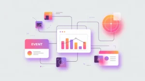
Data Visualization and Business Intelligence (BI) tools transform raw data into visual insights that can be understood and acted upon by decision-makers. They turn complex datasets into charts, dashboards, and reports that highlight patterns, trends, and anomalies. Their importance today lies in making data-driven decision-making accessible, bridging the gap between technical experts and broader organizational teams.
For social innovation and international development, data visualization and BI matter. Mission-driven organizations often work with diverse datasets, ranging from health surveys to education records and crisis mapping. Clear visualization makes this information usable for program staff, funders, and communities alike.
Definition and Key Features
Data visualization tools such as Tableau, Power BI, and Google Data Studio focus on creating interactive visual dashboards. BI platforms go further by combining visualization with data integration, analytics, and governance capabilities. They connect to relational databases, APIs, and spreadsheets to bring disparate data into a unified view.
They are not the same as statistical modeling tools, which focus on advanced analysis, nor are they equivalent to raw spreadsheets, which lack scalability and interactivity. Visualization and BI prioritize accessibility, storytelling, and decision support.
How this Works in Practice
In practice, BI platforms allow organizations to monitor key performance indicators (KPIs), track program outcomes, and forecast future trends. Custom dashboards can be tailored for different stakeholders. Executives may need high-level summaries, while program managers require operational details. Mobile accessibility extends insights to field teams, while role-based permissions ensure sensitive data is protected.
Challenges include data silos, inconsistent data quality, and the temptation to prioritize attractive visuals over meaningful analysis. Implementation also requires capacity-building, as organizations need to develop the skills to interpret dashboards and act on insights responsibly.
Implications for Social Innovators
Data visualization and BI directly enhance mission-driven work. Health initiatives use dashboards to track vaccination campaigns or hospital utilization in real time. Education platforms visualize student learning outcomes and identify gaps across schools. Humanitarian agencies use geospatial visualizations to coordinate relief operations and monitor crisis hotspots. Civil society groups use BI to communicate impact to funders and advocate for policy change with evidence.
By transforming raw information into accessible insights, data visualization and BI empower organizations to make informed, transparent, and timely decisions that drive impact.