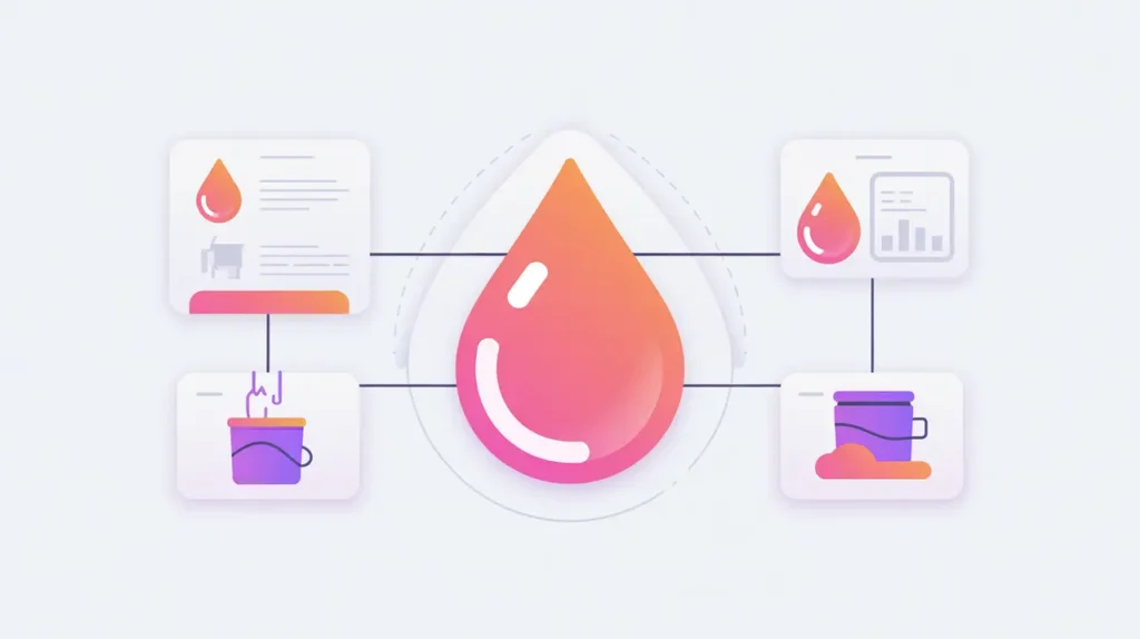
Importance of Outcome and Impact Dashboards
Outcome and Impact Dashboards are digital platforms that visualize key indicators of organizational performance and social change. Outcomes measure short- and medium-term results of activities, while impact captures long-term, systemic change. Dashboards bring these metrics together in accessible, real-time formats for staff, funders, and communities. Their importance today lies in making evidence transparent, actionable, and easier to communicate across stakeholders.
For social innovation and international development, outcome and impact dashboards matter because mission-driven organizations must demonstrate accountability, adapt strategies, and build trust with the people they serve. Clear visualization of progress ensures that data informs decision-making rather than sitting unused in reports.
Definition and Key Features
Dashboards integrate data from MEL systems, surveys, financial platforms, and external datasets. Tools like Tableau, Power BI, Google Data Studio, and custom-built platforms allow users to track indicators across projects and geographies. Features often include filtering, drill-down views, and benchmarking against targets.
They are not the same as raw spreadsheets, which require manual interpretation. Nor are they equivalent to static reports, which quickly become outdated. Dashboards provide dynamic, interactive views that enable ongoing monitoring and insight generation.
How this Works in Practice
In practice, dashboards display indicators such as number of beneficiaries served, cost per outcome, or progress toward Sustainable Development Goals. They can be tailored for different audiences: program staff may need operational detail, while donors and boards require high-level summaries. AI-enhanced dashboards can highlight anomalies, forecast trends, or surface narratives alongside metrics.
Challenges include ensuring data quality, avoiding information overload, and balancing transparency with sensitivity, especially when results involve vulnerable populations. Building staff capacity to interpret and use dashboards effectively is also critical.
Implications for Social Innovators
Outcome and impact dashboards are vital tools for mission-driven organizations. Health programs can track vaccination coverage or patient outcomes in real time. Education initiatives can measure student performance and equity of access across regions. Humanitarian agencies can monitor aid delivery effectiveness during crises. Civil society groups can use dashboards to demonstrate advocacy impact, financial stewardship, or campaign reach.
By transforming data into accessible visual stories, outcome and impact dashboards strengthen accountability, foster learning, and amplify the visibility of social change.